
Information provided by Master Richard, Mistress Rowan and Master Giles in The Lochac Scribes Handbook https://www.sca.org.au/scribe/handbook/Lochac%20College%20of%20Scribes%20Handbook%202012.pdf and discussions on the Lochac Scriptorium Facebook group page https://www.facebook.com/groups/881957955194916/
Background and History
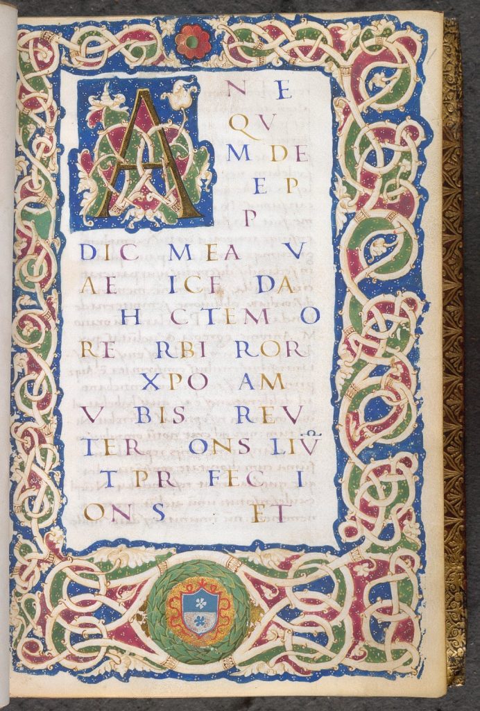
This award blank used in Lochac was designed by Mistress Caitlin de Courcy and Mistress Rowan Perigrynne. The text and the illumination are to be found in many books of the late 14th to 15th centuries and the design is almost particularly of Italian origin. Examples of the style are easily found in period pieces from Florence, Venice, Rome, Naples and to some extent Spain – all magnificent centres of culture and art during the Renaissance. I would place this particular rendition as Napolitan around the late 15th century.
Calligraphy
The calligraphy on the blank is of the humanist school. The hand was inspired by classical Latin texts written in Carolingian minuscule and is peculiar in that it did not evolve gradually from the writing of the day – being more of a contrivance. Its origins are commonly attributed to three prominent Florentine gentles; Pooio, Niccoli and Salutati. The demand for copies of the classics among the wealthy (the originals were generally coveted by their monastic owners) during the Italian Renaissance extended not only to the wording of the texts, but also to their appearance. This this fascination with the old, and the deliberate revival of the ancient minuscule hand that earned the humanist script one of its name names lettera antica. Using the correct pen width on this blank is critical. Again, this particular blank requires a very fine nib. Good results can be achieved with an Osmiroid “Italic Fine” dip pen, and any pen of similar width should be suitable. Test the pen out on a scrap of paper first if you are unsure. In this particular piece, the letters are penned within 3mm wide lines, spaced 7mm apart. Follow these dimensions precisely.
Rubication is again suitable for the text used for the name and maybe even blazon. Start all the fill-in text left aligned with the rest of the wording. Use the Rustic Majuscule which appears at the top of the blank as a basis for any capitals in the name or other wording.
Illumination
The illumination and the calligraphy in this style are quite commonly found together. In yet other examples, the vine-work will be accompanied by a Gothic rotunda script. However in all cases, the colour scheme for the illumination is very rigid. The effect, when replicated can be quite stunning, and there is still a lot of latitude for individual artistic decisions. Specifically, the ground for the vermiculato (wormlike vines) is basically always red, green and blue. There are some examples (e.g. Paris, Bibliotheque Nationale MS lat. 5713 f.Ir) where gold was used in addition to the three colours for the background, but this was more of an exception than the rule. The partition of the background into sections by the vine-work lends itself nicely to an alternating colour scheme with the use of your primary colours. For the outer section of the design (i.e. the outermost edge of the illumination), examples in period to my knowledge are always blue. Also, in historic examples of the style you will notice the presence of small white or yellow dots (yellow seems to appear only on the green areas) in groups of three, randomly dispersed over the coloured areas. I would recommend that you begin the colouring with the blue exterior areas, working your way inward as you go with any combination of red, green or blue that appeals.
Other aspects of the illumination you should attempt to adhere to are:
Capital: Solid gold
Wreath
• Green (shaded with a lighter green) on Solid metallic gold background
• Green on background quartered red and blue
• Entire wreath quartered pale and shaded red and blue
Vines • Void or colour white • Shaded with paled yellow ochre
As with all illumination, ensure that your paint is well mixed and that good paint consistency is maintained.
This style is often called ‘white vine’ but is more correctly called ‘bianchi girari’, (white branches) and developed in northern Italy and quickly became almost universal for Humanist manuscripts.
The colours on this pre-print are always red, green and blue (cadmium red pale, permanent light green, and ultramarine) with a gilded capital.
King’s 20, Folio 1
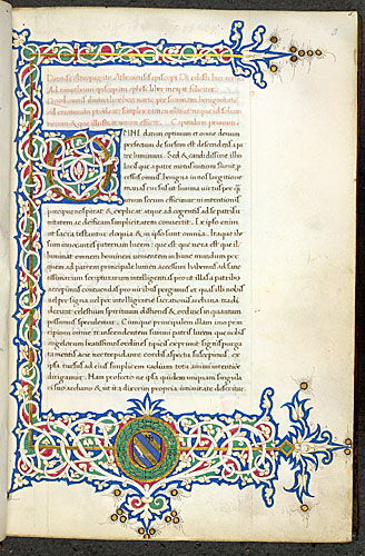
Burney 123, Folio 3
Illuminated white vine initial ‘O'(mne) and three-sided border incorporting the arms of Federico da Montefeltro in a wreath in the lower margin, at the beginning of Dionysius the Areopagite’s De caelesti hierarchia.
Origin: Italy
This page is neither an official publication of the SCA Ltd (Australia) or the SCA nor is its content meant to convey official SCA policy