
Information provided by Master Richard, Mistress Rowan and Master Giles in The Lochac Scribes Handbook https://www.sca.org.au/scribe/handbook/Lochac%20College%20of%20Scribes%20Handbook%202012.pdf and discussions on the Lochac Scriptorium Facebook group page https://www.facebook.com/groups/881957955194916/

Celtic Scroll
Designed by Bryony Beehyrd, based heavily on Kells f124r.
Lindisfarne, designed by Caristiona Nic Bheathain.
Background and History
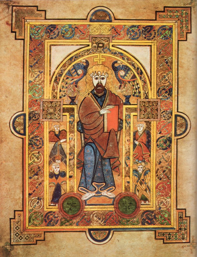
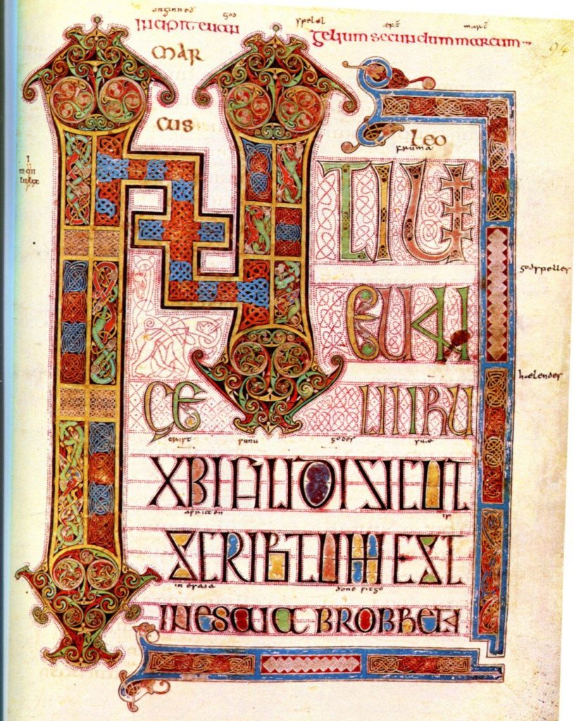
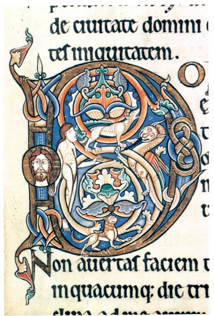
The award blank use in Lochac was designed by Mistress Bryony of the Bees (OP) and Sir Haos Windchaser. The majuscule and and the knotwork capital are typical of pieces found in the Book of Kells and the Lindisfarne Gospels. In fact, if you are looking for idea on the illumination of the capital, it was sourced from Kells, Matthew XXVII and begins the phrase “Tunc crucifixerant XRI cum eo duos latrones” (Then two robbers were crucified with him).
All that can be said with certainty is that the style of calligraphy and illumination in the Book of Kells is distinctively connected with the monasteries of Ireland, Scotland and the North of England (Lindisfarne). This geographical group is sometimes described as the insular, from which we find the name for the calligraphy, insular majuscule. The script owes much of its evolution to Roman half-uncial hands of the 3rd-5th centuries, which consequently developed under the influence of Celtic artistic traditions.
In an historical context, insular majuscule is to be found in period sources from the 6th to 9th centuries. Kells itself dates at around 800. It was completed at the height of the popularity of the script. However, like so many to follow, was made obsolete by the need for less formal and more practical writing.
Calligraphy
A lot of work is required to master this hard. The pen is held with the nib either horizontal, or not far off. Serifs adorn the tops of the letters, and subtle changes in pen direction affect the conclusion of the downward vertical stroke. Osmiroid “Italic Medium” or “Italic Broad” nib in a dip pen, or any similar pen width should be suitable. Test the pen out on a scrap of paper first if you are unsure. In this particular piece, the letters are penned within 4mm wide lines, spaced 9mm apart. Follow these dimensions precisely.
Illumination
If you have a desire for the more vivid colours in your illumination, you can get it out of your system by completing a few of these blanks. I recommend you have a look at some facsimile pages from Kells or Lindisfarne. They are typical of the period, although the former is noted for its flamboyance. I cannot stress the importance of doing some research for yourself. Just one afternoon in a good library can provide so much more insight than all of my writing could hope to achieve. On the page from which the capital “T” is sourced, colours that can be found are red, blue, yellow, purple, green, black and white. As you can see, Celtic art was rich in vivid colour. Most of the outline of the original capital looks like faded purple lake, and the interior knotwork is all yellow. One of the feet of the beast forming the capital is green.
Here are some other suggestions that you may find helpful with the illumination. Knotwork: All in a single colour (eg green) • Alternating multiple colours (red, green, blue) for successive sections of knotwork
Exterior : Any single colour (eg yellow) Banner Letters : All in a single colour (eg yellow) • Alternating multiple colours (yellow and purple lake) Dots • Leave in black (around letters) • Add a dot of single colour to each as a highlight (especially red)
Whatever you do here, just ensure that the overall effect is not too mind blowing. You can use as many colours as you like, but too many will ruin the impact a fewer number of well chosen tinctures can produce. This really is one of the blanks for
which you will have very few restrictions, just base what you do on the original text. In general though, colours should be
limited to red, green, blue, yellow, purple lake, white and black. Of course if, through your research, you find examples of other tinctures being used then by all means use those.
The predominant colours are purple (orcein), yellow (orpiment), red (minium), blue (woad, indigo and ultramarine), and green (verdigris). Good gouache substitutes for AAs would be alizarin crimson, cadmium yellow pale, cadmium red pale, ultramarine, and permanent light green or sap green. There is no metallic gold. (Technically there was in the original, ground up and mixed with purple to add lustre.)
*Pro tip from Master Giles: “Notice the red dots around the letters. Use a very fine 000 brush with a sharp point for best results, and practice on paper towels. Don’t use the handle of your brush”


Hours of Louis XII c. 1490
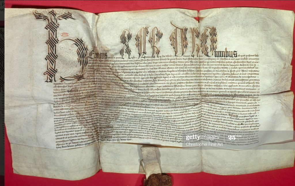
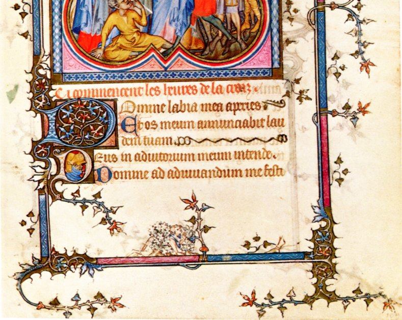
Treaty of Windsor c. 1532
This page is neither an official publication of the SCA Ltd (Australia) or the SCA nor is its content meant to convey official SCA policy.